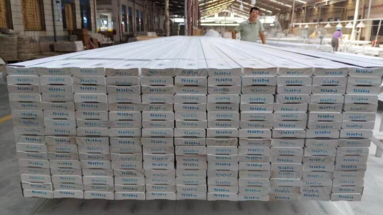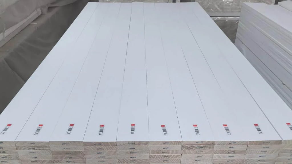
Since 1995, Goodwood Mouldings has manufactured wood moulding (also spelled molding in the US), and our priming and finishing lines are run in-house, not outsourced. That means I see color disputes from the factory side. Most of them share one root cause: the contract says "color must match," but nobody wrote down a number for what "match" means.
This article gives you that number language: what ΔE measures, where the human eye starts to notice a difference, and what targets a project specification can realistically ask for. It also covers where even a low ΔE won't protect you.
What does ΔE actually measure, and when can the human eye see it?
ΔE is the distance between two colors in the CIE Lab color space, expressed as a single number. A larger number means a bigger difference. A ΔE above 2.0 is generally noticeable to the human eye in natural light1, and above 3.0 is the threshold the industry commonly treats as "significantly different."
These are perception thresholds, not pass/fail rules. They tell you when a difference becomes visible, but not what your project should accept. The table below shows how I read ΔE values in acceptance conversations.
Table 1: How to read ΔE values in a moulding acceptance context
| ΔE range | What it means visually | How we treat it |
|---|---|---|
| ≤ 1.0 | Below the 2.0 perceptibility threshold | Our internal ceiling for batch-to-batch difference on multi-shipment projects |
| 1.0 – 1.5 | Below the 2.0 perceptibility threshold | Our internal target band for standard colors |
| 1.5 – 2.0 | Approaching the point where a difference may be noticed | Our internal upper limit for customer-supplied color panels |
| > 2.0 | Noticeable in natural light | Outside all of our internal control targets |
| > 3.0 | Commonly accepted as "significantly different" | A clear non-conformance in any acceptance conversation |
The ≤1.0, ≤1.5 and ≤2.0 figures are our own control targets, not industry standards. The 2.0 and 3.0 thresholds are the general perception references. Keeping the two separate matters when you write a specification, and I return to it below.
Why can't a printed RAL or NCS color card be the final reference?
A printed color card is a printed product, and printed products vary from batch to batch. It is a good starting reference, but it cannot settle a dispute. If both sides treat the card as absolute truth, a small variation in the card itself becomes an argument about the moulding.
We support color matching against the RAL and NCS systems, and these are the right way to communicate a target color. I would not, however, treat the card as the final measuring stick for acceptance. A printed color reference has its own batch-to-batch variation, so a ΔE figure measured against a card carries uncertainty that the moulding did not create.
This limitation applies to every supplier, not only to us. A supplier who says "we match the card exactly" is promising something the card cannot guarantee. For project work, I recommend the buyer and supplier agree on a physical reference sample before production, and state in the specification that acceptance is measured against that agreed sample. This is a recommendation for how to write the specification, and you should confirm the exact sample procedure for your project with us in advance.
What ΔE targets should a project specification ask for?
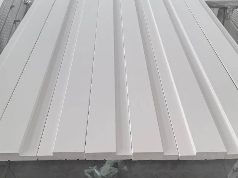
For painted moulding, we work to ΔE ≤ 1.5 for standard colors, ΔE ≤ 2.0 for custom colors matched to a customer-supplied panel, and ΔE ≤ 1.0 between batches on the same project. These are our internal control targets, not industry standards, and I'd suggest you use them as a starting point for a specification conversation.
Table 2: Our ΔE control targets by situation (Goodwood internal targets)
| Situation | ΔE target | Nature of the number |
|---|---|---|
| Standard colors (common RAL/NCS shades) | ≤ 1.5 | Internal control target |
| Custom colors matched to a customer-supplied panel | ≤ 2.0 | Internal control target |
| Batch-to-batch, same project shipped in stages | ≤ 1.0 | Internal control target, applied strictly on staged shipments |
| Perceptibility in natural light | > 2.0 | General perception threshold, not a Goodwood target |
| "Significantly different" | > 3.0 | Commonly used industry threshold |
The batch-to-batch figure is deliberately the tightest one. When a project ships in stages, the risk is not a single batch being slightly off its target. The real risk is that pieces from two shipments end up installed next to each other, where the eye compares them directly. A batch that sits comfortably within its own tolerance can still look wrong beside the previous one. That is why we apply ≤1.0 strictly whenever a project is delivered in stages.
The custom-color target is looser at ≤2.0, which sits right at the edge of what a buyer may notice. I'd rather tell you that than hide it. If your project requires a custom color to be indistinguishable from a reference panel, discuss the panel and the target with us before ordering, not at delivery.
When you write acceptance terms, I'd suggest specifying three things: the reference (an agreed physical sample, not a printed card alone), the ΔE limit for a single batch, and the ΔE limit between batches. Separating the last two is the detail most specifications miss.
When is a low ΔE target still not enough for a project?
ΔE is an instrument reading of one measured spot. It does not guarantee that every piece looks identical under every lighting condition or on every substrate. A low target reduces risk, but material behavior sets limits that no coating process can remove.
Here are the limits I tell project buyers about before they order:
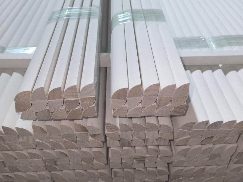
- Finger-jointed moulding: a finger-jointed profile is built from separate wood segments, so after painting, neighboring segments can show slight color variation, sometimes visible under raking (side) light. This is a structural feature of the product, and any supplier's finger-jointed moulding will show it.
- Clear-finished solid wood: natural wood color varies with origin and growing conditions, and that batch-to-batch variation cannot be fully eliminated. If a project needs strictly consistent color (ΔE below 1.0), choose painted moulding instead of clear-finished solid wood.
- Over-specifying: asking for a tighter ΔE than the material and process can realistically hold does not improve the result. It raises cost, and it creates a number that is hard to verify at acceptance. A realistic target that both sides can measure is worth more than an aggressive one that neither side can enforce.
If you are comparing suppliers, notice who volunteers these limits. A supplier who gives you a target ΔE and also tells you where the target stops applying is describing something they have actually measured.
The short version for your specification
- Treat ΔE > 2.0 as the point where a difference becomes noticeable and ΔE > 3.0 as a clear non-conformance.
- Don't accept a printed color card as the sole reference. Agree a physical sample.
- Set separate limits for a single batch and for batch-to-batch difference on staged projects.
- Match the finish to the color-consistency requirement: paint for strict consistency, not clear-finished solid wood.
- Confirm the numbers with your supplier before production, not at delivery.
Working on a multi-phase project and need these numbers in writing before you finalize your spec? Confirm our batch ΔE control target for your project.
For a full breakdown of which moulding type fits your color-consistency requirement, see our guide to choosing between solid wood, finger-jointed, MDF and veneered moulding (link to be updated once the material comparison guide is published).
FAQ
Is a lower ΔE always better? Not necessarily. A ΔE target below what the material and coating process can reliably hold doesn't improve the result — it raises cost and creates a number that can't be verified consistently at acceptance. The right target matches the finish type and the project's actual visibility requirements, not the lowest number possible.
Does matching a RAL or NCS color card guarantee consistent color across an order? No. Printed color cards vary from batch to batch, so a card alone isn't a reliable final reference. We recommend agreeing on a physical painted sample as the acceptance reference, in addition to specifying a RAL or NCS target color.
Can finger-jointed moulding meet a strict ΔE target? Painted finger-jointed moulding can meet standard ΔE targets, but because it's built from separate wood segments, slight color variation between segments can sometimes be visible under raking light after painting. This is a structural characteristic of finger-jointed products generally, not a defect specific to one supplier.
What's the difference between a single-batch ΔE target and a batch-to-batch ΔE target? A single-batch target controls consistency within one production run. A batch-to-batch target controls consistency between separate shipments on the same project — which matters more when material from different batches will be installed side by side, since that's where the eye compares colors most directly.
Should I specify the same ΔE tolerance for painted moulding and clear-finished solid wood? No. Natural wood color varies with the tree and growing conditions, so clear-finished solid wood cannot reliably hit the same tight ΔE tolerances as painted moulding. If a project requires strict color consistency, painted moulding is the more predictable choice.
See how the CIE Lab color space translates a numeric color difference into what a human observer actually perceives. ↩